Overview Screen
The main (or Overview) screen displays a quick-glance summary of your account. It presents several graphs and charts.
In the upper-right corner, Net worth is displayed, allowing you to see how many wallets are connected to your account, the number of networks transacted on and the total amount of assets held.
General tab
Net Worth Over Time Widget:
This widget provides a comprehensive, interactive visualization of your portfolio's total value over a selected time period. It combines a daily trend line with a detailed asset breakdown to help you understand performance drivers.
Header Metrics & Controls
Total Change: Displays the net change in portfolio value (in USD and percentage) for the selected period (e.g.,
+24,874,296 USD (19%)). A green arrow/text indicates growth, while red indicates a decline.Date Range Selector: A calendar picker (e.g.,
Nov 8, 2025 -> Dec 7, 2025) allows you to define the specific timeframe for analysis.Expand Button: Click the "Expand" button to view the chart in full-screen mode for a more detailed analysis.
Filter/Options: The drop-down menu (triangle icon) and three-dot menu provide additional export or view options.
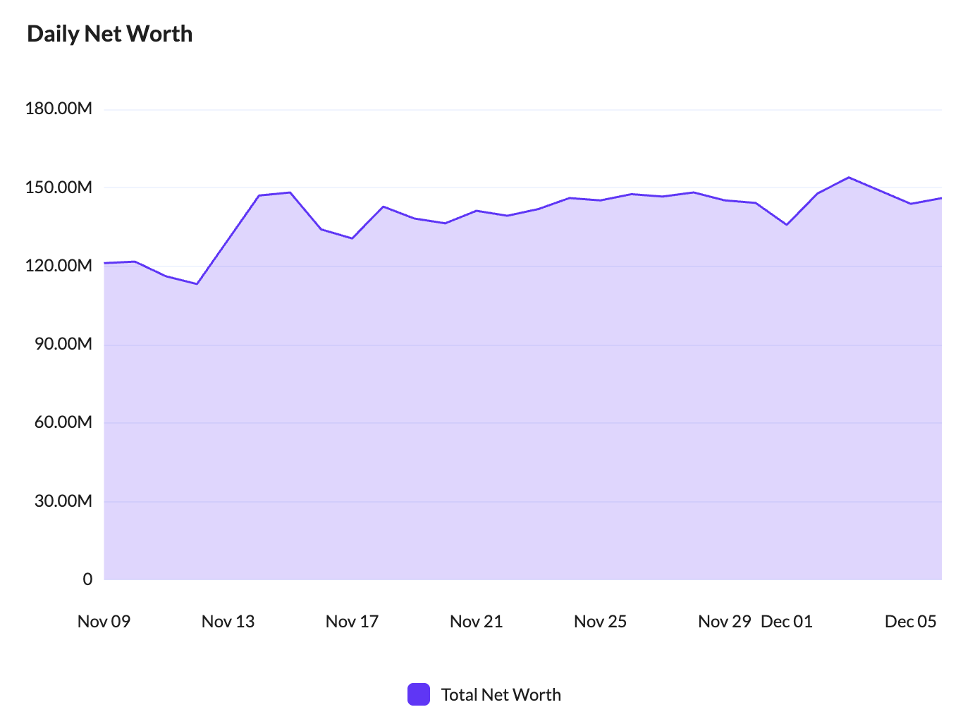
1. Daily Net Worth Chart (Left)
This line chart tracks the aggregate USD value of your portfolio day-by-day.
Y-Axis: Represents the Total Net Worth in USD (e.g., 30M, 60M, 90M...).
X-Axis: Represents the timeline (days/months).
Trend Line: The purple line visualizes the fluctuation of your total portfolio value over time.
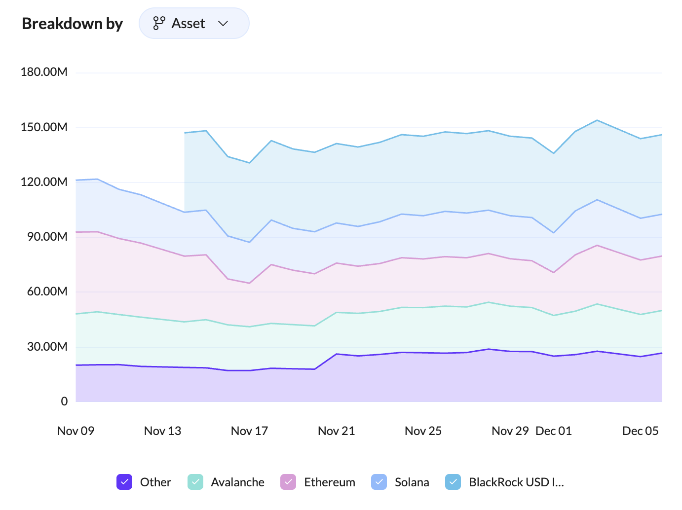
2. Breakdown By Asset Chart (Right)
This stacked area chart breaks down your total net worth to show the contribution of individual assets.
Breakdown Selector: The "Asset" dropdown allows you to switch the breakdown view (e.g., potentially by Wallet, Balance state, or Balance name).
Asset Layers: Each colored layer represents a specific asset's value over time:
Purple: Other (aggregated smaller assets).
Green: Avalanche.
Pink: Ethereum.
Blue: Solana.
Light Blue: BlackRock USD Institutional Digital Liquidity Fund (BUIDL).
Legend: An interactive legend at the bottom allows you to toggle specific assets on or off to isolate trends.
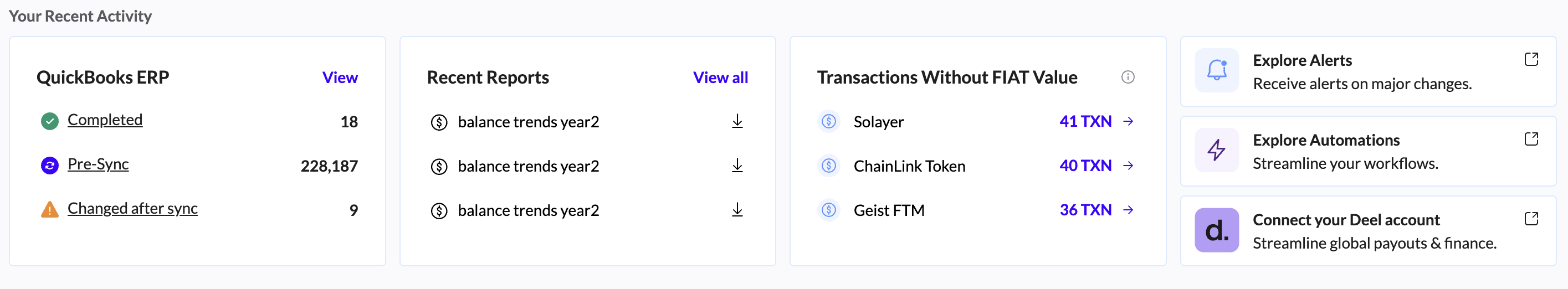
Under Your Recent Activity:
ERP Integration: Once your ERP is integrated with Tres, this section shows how many transactions have been completed or properly synced into your ERP system, how many are ready to be synced, and how many have an error that requires attention. Generally, the errors are due to a transaction missing a fiat value.
Recent Reports: If you have run any reports in either the Ledger or Assets screens, they will be displayed here and are easily downloadable. If you do not see them, click View All to display the Reports screen, where you can download all past reports.
Transactions Without Fiat value: Transactions that are missing fiat value are listed here. These transactions will not be able to be synced into your ERP system. Cost basis will also not be able to be calculated for transactions missing values. You can click the tokens that are missing fiat values and enter them manually. To perform bulk upload, contact Customer Support.
Explore Automations: Directs you to the automations tab where you can create automations for tasks that are repetitive such as tagging transactions or generating recurring reports. If an automation you are looking for is not listed, please contact us.
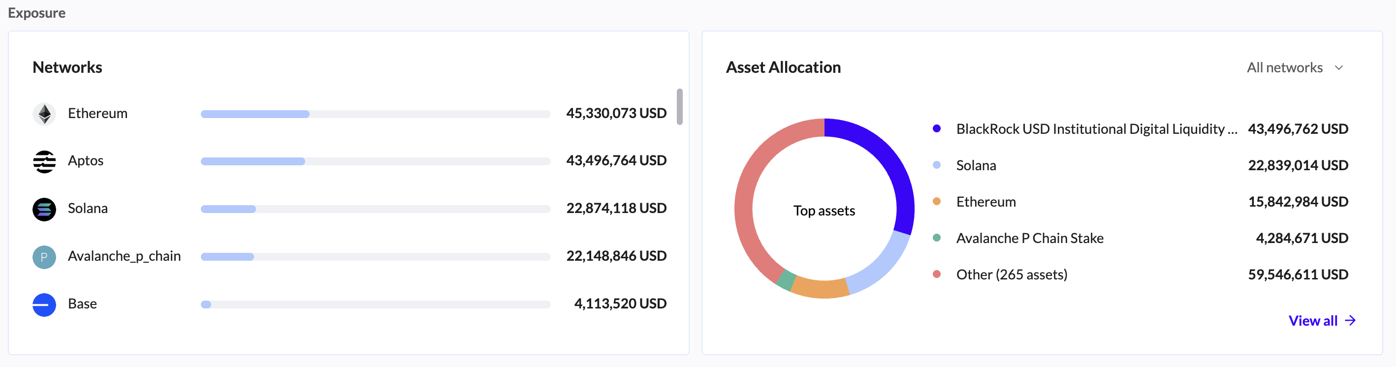
Further down: Networks & Asset Allocation
Networks: This section displays the networks with the highest levels of fiat activity. Hover with your cursor over a network to see the percentage of exposure your organization has to a specific network.
Asset Allocation: In this section, the Assets with the highest fiat values are displayed. You can manipulate the Assets displayed by clicking All networks and selecting a specific network. Hovering over an asset shows the percentage of that Asset held, in relation to total holdings. You can also click an asset and be directed to the Ledger screen where all transactions involving the asset clicked are shown.
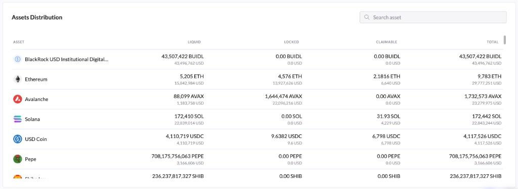
Assets Distribution Table: This comprehensive table displays a detailed view of every asset in your portfolio, categorized by its current liquidity state (Liquid, Locked, or Claimable).
Asset: Displays the asset's icon and full name (e.g., Ethereum, Solana, USD Coin).
Liquid: The balance currently available for immediate transfer or trade. Shown in both Native Units and USD Value.
Locked: The balance currently staked, delegated, or locked in smart contracts. Shown in both Native Units and USD Value.
Claimable: Rewards or earnings that have accrued but have not yet been claimed to your wallet. Shown in both Native Units and USD Value.
Total: The aggregate sum of the Liquid, Locked, and Claimable balances. This represents your total exposure to the asset.
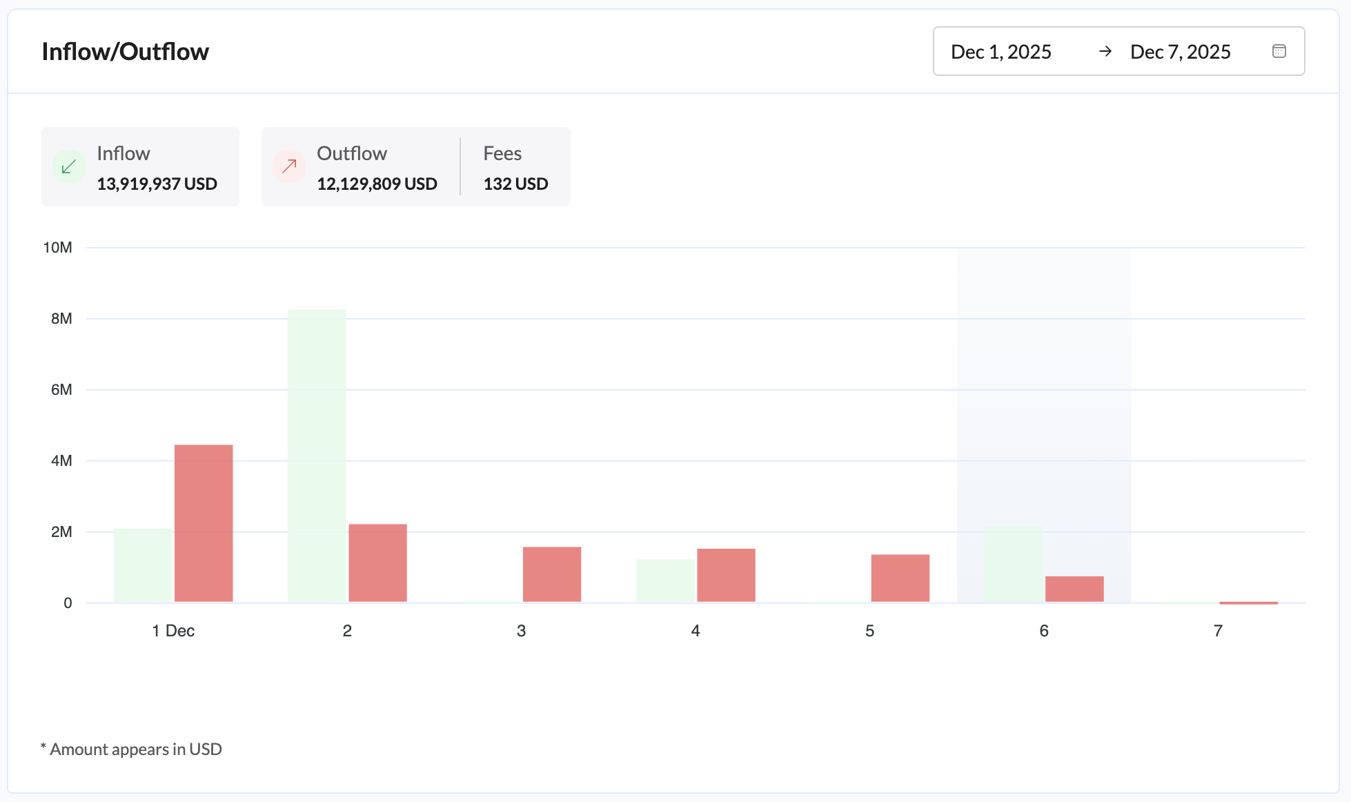
The Inflow/Outflow Widget chart and the Top Wallets list:
The Inflow/Outflow Widget: This widget provides a visual analysis of your portfolio's financial movements over a specific time period, helping you track incoming and outgoing funds alongside transaction fees.
You can:
Construct your data in ways that are unique to your needs.
View the inflow and outflow activities of all your wallets based on whichever date range you would like.
Filter for either only inflows or only outflows/fees just by clicking on each button.
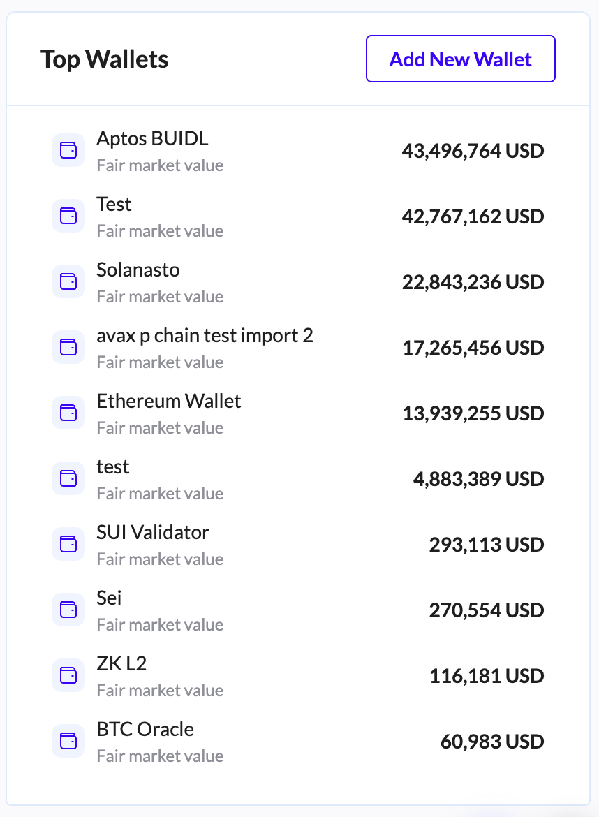
Top Wallets lists the wallets with the highest balances. By clicking on any wallet, you can view the wallets tab. Click View All Wallets to see all wallets in the Accounts screen, where you can apply configurations, as well as gain some balance insights into the wallets.
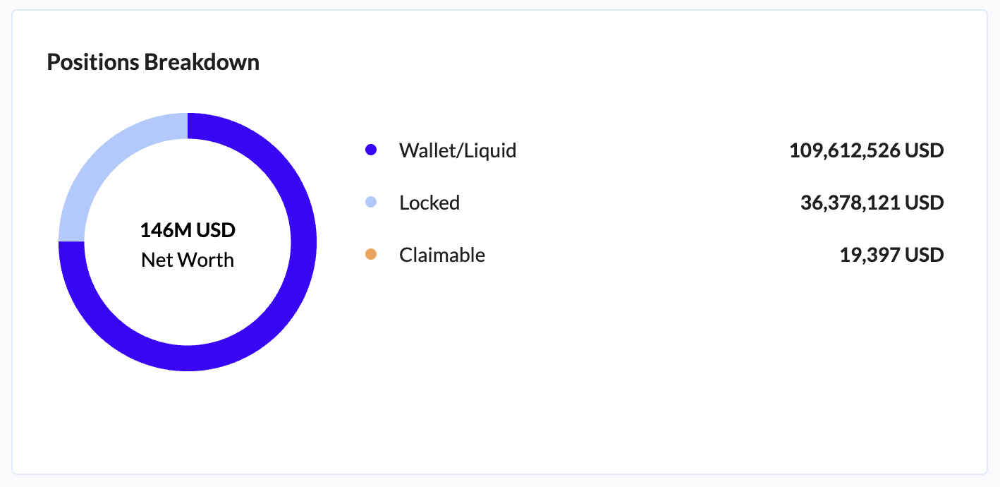
Positions Tab
Positions Breakdown: This chart depicts the ratio of your assets in the categories:
Wallet/Liquid
Locked
Liquidity Pools
Claimable.
Hovering over the category shows you the percentage of that category held in relation to total DeFi holdings.
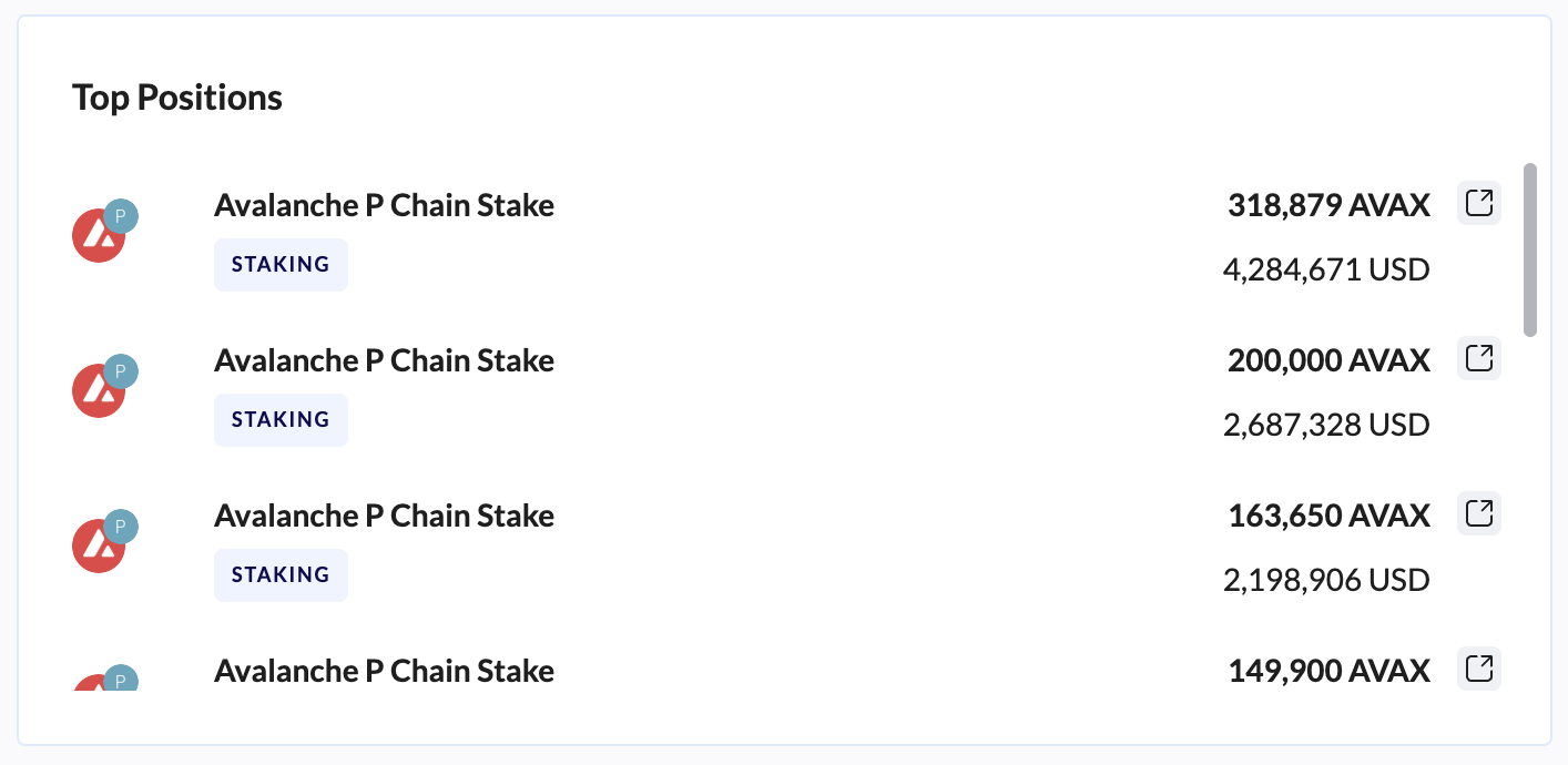
Top Positions: Provides a high-level overview of the positions with the greatest value.
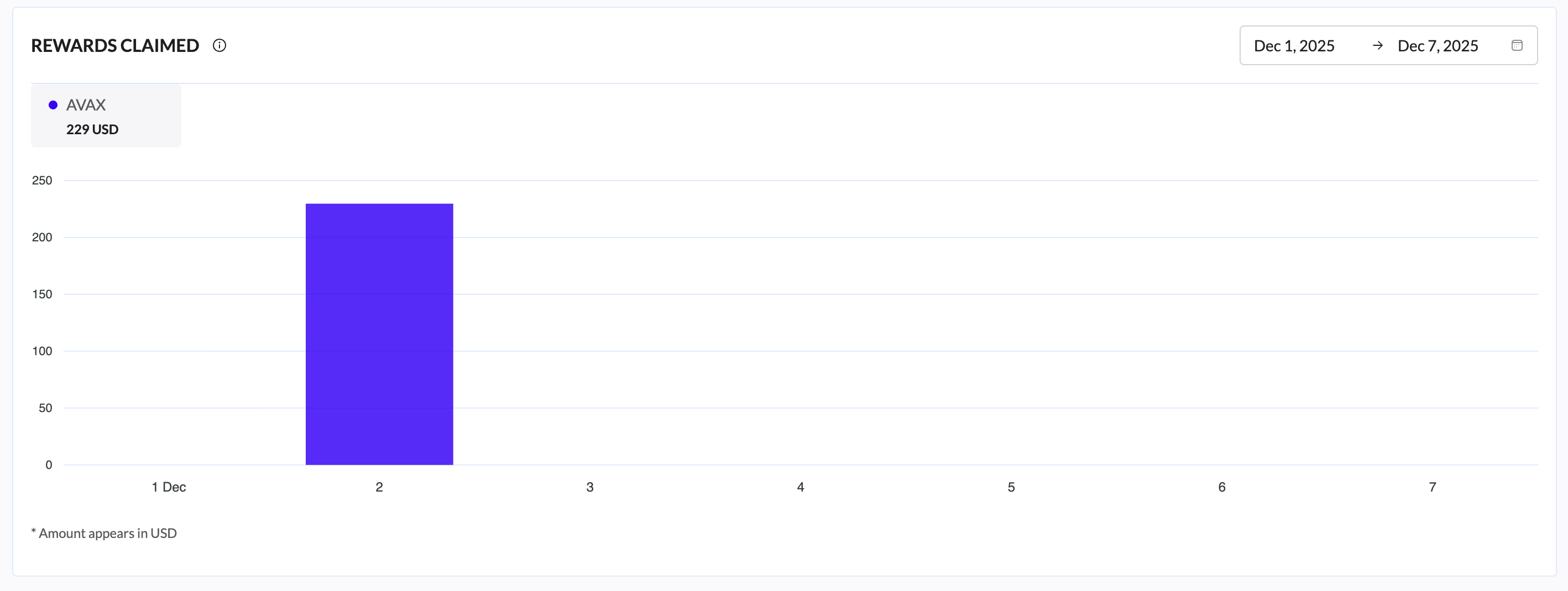
Rewards Claimed: Gives you a breakdown of the rewards you’ve claimed during the displayed time period. The time period can be easily customized for whichever date range you like, using the date in the upper-right corner.
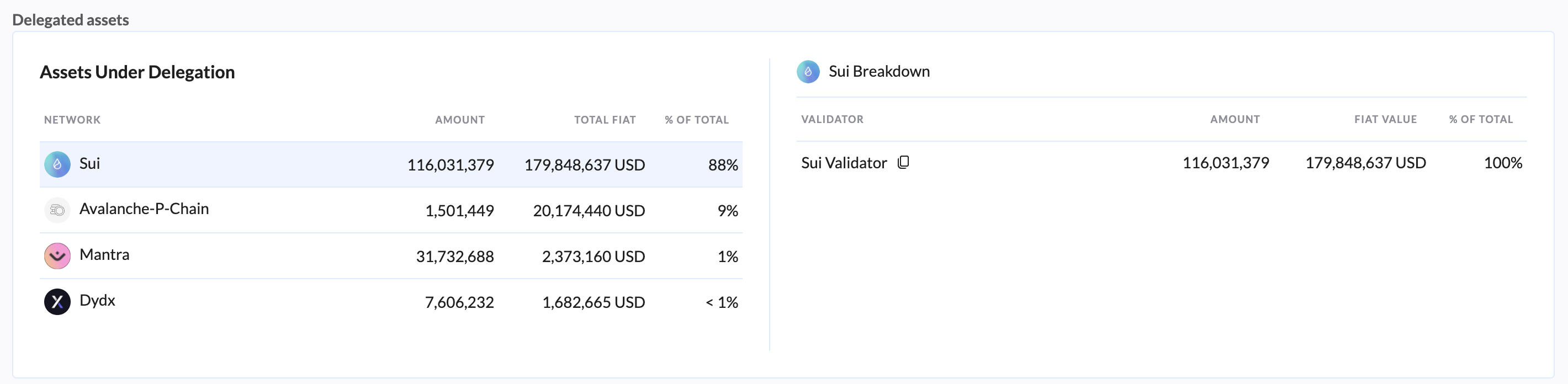
Delegated Assets: Provides a breakdown of the assets that have been delegated and the percentage of a specific asset that has been delegated in relation to all delegated assets.
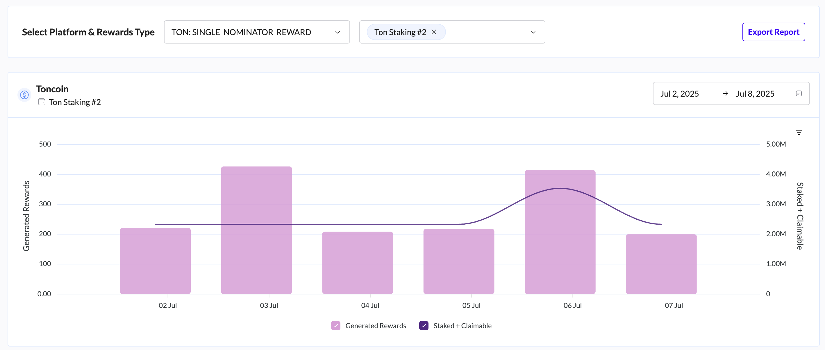
Staking Activity Tab
The Staking Activity tab offers deep analytics into your historical staking performance, allowing you to track rewards generation and balance trends over specific periods.
Controls and Filters
Located at the top of the tab, these controls allow you to refine the data displayed in the charts:
Select Platform & Rewards Type: A dropdown menu to isolate specific staking platforms (e.g., "HYPERLIQUID: REWARD").
Select Wallet: Filter the activity by a specific source wallet.
Export Report: A direct button to generate and download a comprehensive staking activity report.
Performance Charts
For each selected position, the tab displays a detailed dual-axis chart:
Generated Rewards (Bar Chart): Visualizes the specific amount of rewards earned on a daily basis.
Staked + Claimable (Line Chart): Tracks the total value of your staked principal plus any unclaimed rewards (purple line).
Date Range: Use the date picker (e.g., "Nov 19, 2025 -> Nov 25, 2025") to focus on specific timeframes.
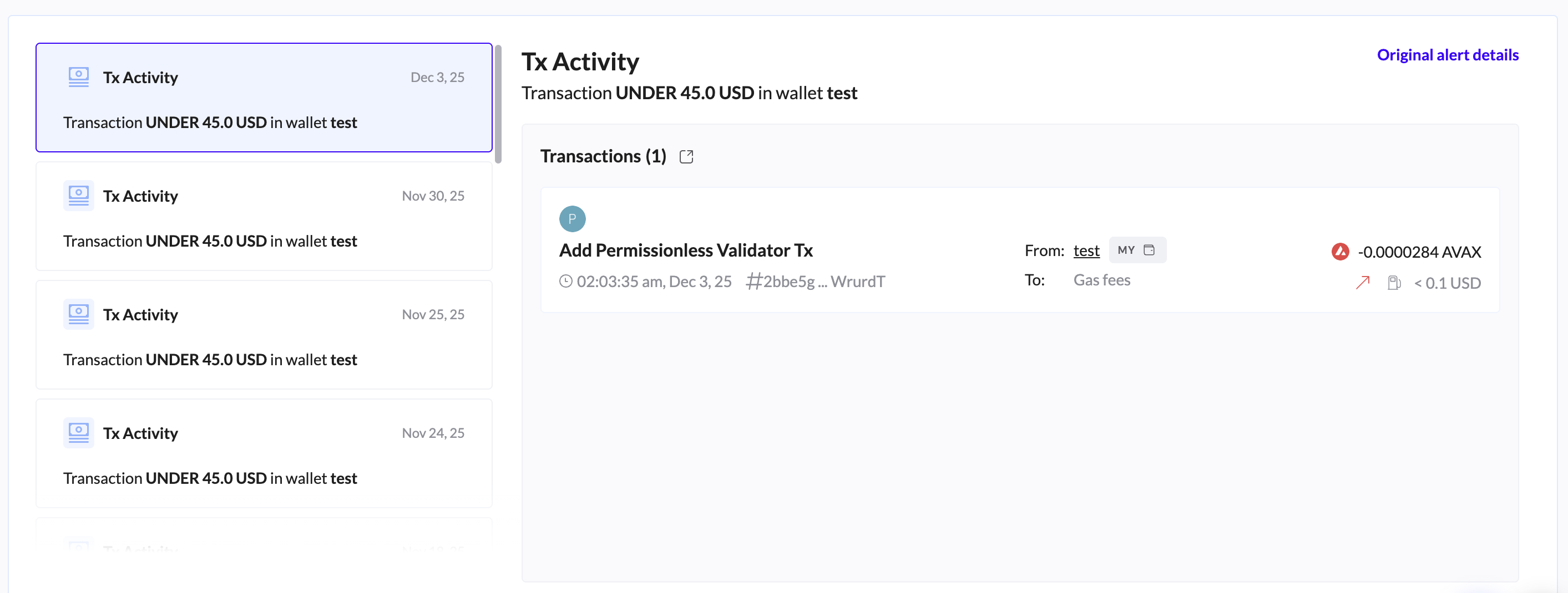
Alert Center Tab
The Alert Center tab acts as your notification feed, displaying a history of all triggered system alerts.
Alert Feed: The left pane lists recent alerts sorted by date (e.g., "Tx Activity" on Nov 25).
Alert Details: Clicking an alert in the feed opens the details pane on the right, showing specific transaction information, the triggered threshold (e.g., "Transaction UNDER 45.0 USD"), and links to the relevant transaction hash.
Learn how to configure alerts here.
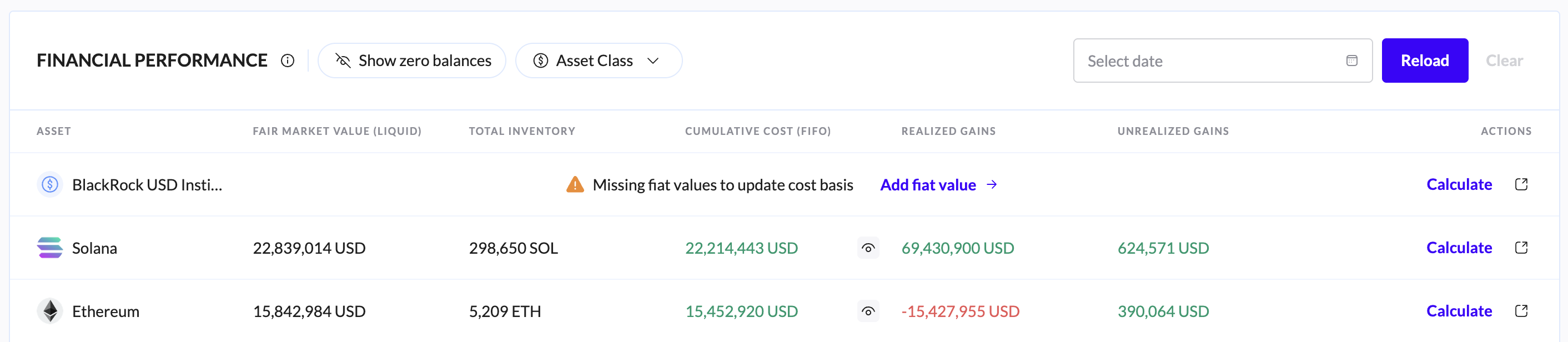
Cost Basis Tab
The Cost Basis tab is the central hub for financial performance analysis, utilizing the FIFO (First-In-First-Out) accounting methodology to track gains and losses.
Header Controls:
Show Zero Balances: Toggle this to view or hide assets that you have fully disposed of (zero balance).
Search Asset: Quickly locate specific tokens within your portfolio.
Select Date: View the cost basis snapshot for a specific historical date.
Reload: Triggers a data refresh to ensure the latest calculations are displayed.
For more information, visit this guide.
Multi Entity Tab
For organizations managing multiple legal structures, the Multi Entity tab provides a consolidated view of all subsidiary entities.
Key Data Columns:
Entity: The name of the legal entity or subsidiary.
Total Networth ($): The isolated net worth for that specific entity.
Internal Accounts: The number of wallets/accounts belonging to that entity.
Transactions: Total transaction volume for the entity.
Data Collect: Indicates the sync status (e.g., COMPLETED).
Action: Click the "Open" button to switch your dashboard context to that specific entity.
Vested Assets Tab
The Vested Assets tab is designed to track tokens that are subject to a vesting schedule.
Purpose: Monitor upcoming vesting events and track unlocked versus locked tokens.
Search: Use the search bar to find specific vested token contracts.
Global Actions (Header)
Accessible from any tab on the Overview page:
TRES Analyst: Click the chat icon in the bottom right to open the AI-powered assistant for instant portfolio insights.
Data Collection Status: The top banner displays the "Data collected" timestamp. You can check here to see if a sync is currently "IN_PROGRESS" or "COMPLETED".